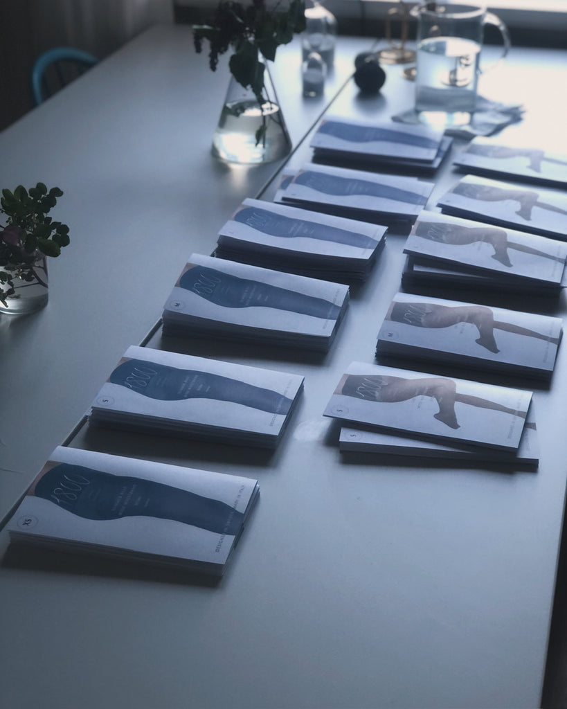

Picture of the new packaging printed (it was a mess, it's so annoying when what you print isn't the same color printed as on the screen (even though I tried different color profiles for the printer that should have worked), but then I figured out what was wrong: I had the wrong format on the original image, had png should be jpg, and how happy you are when you figure out what's wrong. 🙏
Then I folded all the printed papers. To get a good fold line, I use a wooden butter knife that I drag over the fold. Good tip if you're going to fold something! :) I've always liked folding paper, getting good fold lines at 90 degrees, I don't know if everyone likes folding things, it's not talked about much, but I think it's so cool when it gets a good fold. 📐
Making packaging for products is one of my favorite activities, there is so much to keep in mind, such as: what should be conveyed, what information do you want to receive as a customer, how should that information be conveyed in the most accessible way possible, and which at the same time stays within the aesthetic profile I want the brand to have. As well as being both beautiful and informative at the same time. It is easy to want to have a lot of information on packaging, so you have to sift and make trade-offs between what information is important to the customer, and what information is superfluous.
Then there is the actual design of the packaging, such as: how should it be closed, how should it be opened, which functions must be included and which are superfluous.
And then you have to think about how it will be manufactured and what modifications are needed for it, for example with this packaging I had the size icon in a different place, higher up on the packaging and in a different shape, what happened then was that when I printed the icon was cut off in different places on different papers, and the whole icon didn't come through (the print is printed so it's bigger than the paper, so you have to add some space to make room for everything not to come through, in graphic design language that space is called "bleed"), so then I moved the size icon down to a place where I'm sure the whole icon will print through. So there are several different steps to keep in mind when making packaging, I like that you have to look at it from several different perspectives to make a good package. So interesting! :)
Warm greetings from Clara